A family GPS tracker built on consent, not surveillance — and the acquisition system that carried it to 4.8M downloads.

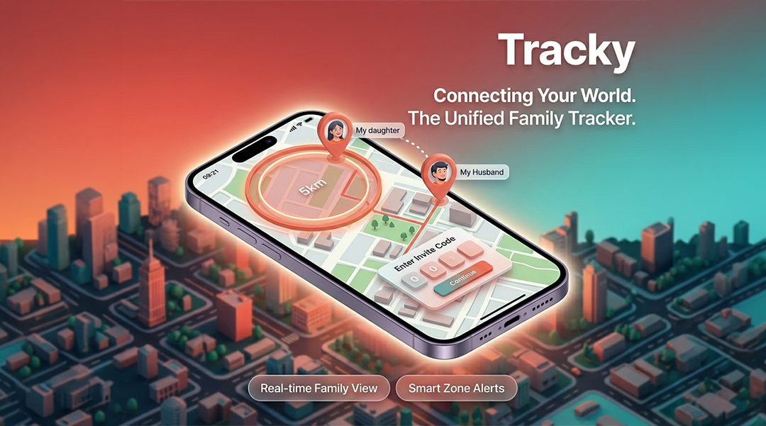
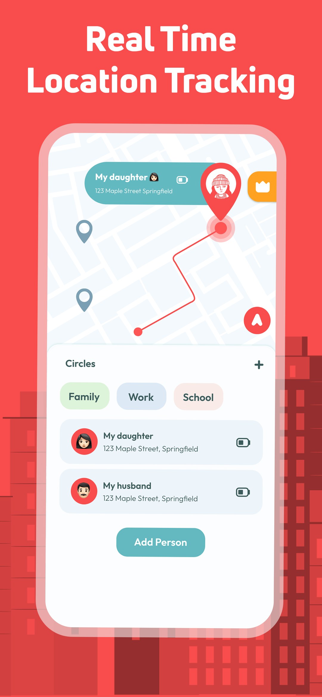
Tracky is a family GPS tracking app published under Whotechs, now past 4.8M downloads and 1M active installs. Families join a private circle and see each other on a live map: where everyone is, when they arrived, whether they left a safe zone, and how to reach them fast if something goes wrong.
I was the only designer on it from day one — information architecture, the full interface system, motion, the brand, and every store and ad asset that brought users in.

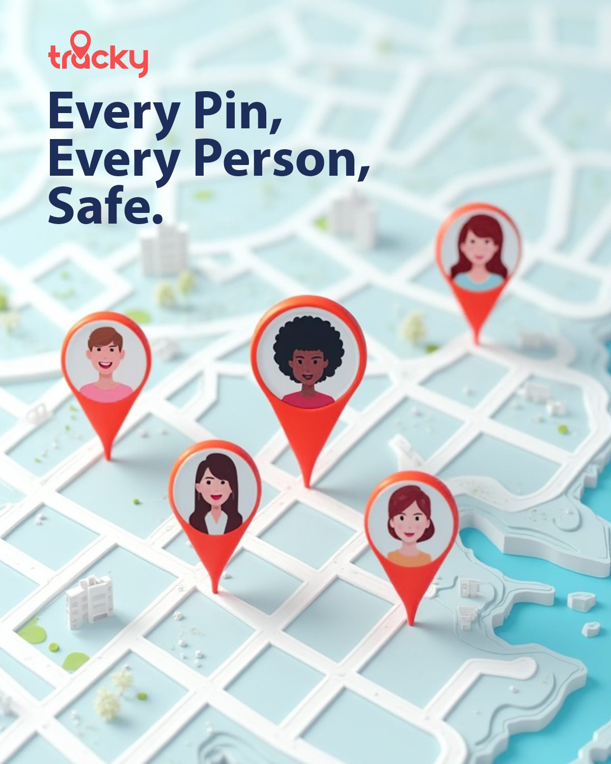
The mark is the map pin everyone already knows how to read, softened into a rounded drop and cut with a family silhouette. No eye, no radar, no crosshair — the visual vocabulary of surveillance was off the table from the first sketch.
One warm accent does the heavy lifting: warm enough to read as care rather than alarm, saturated enough to survive a 48px app icon on a crowded home screen.
Nothing here was designed in one pass. Each stage produced an artefact the next one argued with.
I read through 500+ reviews of twelve competing location apps and sorted every complaint into a pain map. The same three showed up over and over: the app drains the battery, the permission screen feels like a trap, and it makes my kid feel spied on. Those three complaints became the brief. From there I wrote three personas that stay in tension with each other — the parent who wants more visibility, the teenager who wants less, and the grandparent who needs the whole thing to work without a tutorial.
Low-fidelity first, in grey. The map had to be the home screen — not a tab you navigate to — because the question users open the app with is always the same one. Everything else got pushed into a bottom sheet that rises over the map instead of replacing it. Onboarding was cut down to three steps, and the location permission was moved to the point where the user has already seen why it is needed, not before.
Interactive Adobe XD prototypes went in front of 20+ people across all three personas. The family circle setup took four rounds to get right. The version that finally worked stopped asking users to configure anything before they had seen a single map: invite first, explain in the user's own language, request the permission last. Watching a grandparent try to find the invite button was worth more than any heatmap.
After launch the work changed shape. The paywall ran as three design variants in A/B testing, and support tickets became the research pipeline — every recurring ticket pattern was treated as a design defect, not a support problem. At this volume, a single unclear line in a permission dialog turns into thousands of failed setups per week, so most post-launch iterations were small, specific and measured.
Users hand over the most personal data they have — where their child is, right now. One interaction that feels controlling and the app gets deleted, reported, or quietly disabled by the person being tracked. On top of that, free users had to become subscribers against aggressive growth targets, without a single dark pattern.
Sharing is mutual and always visible — if you can see someone, they can see you, and the interface says so on the screen where it matters. Permissions are asked after the value is shown, in plain language. Alerts are tiered so only genuinely critical events interrupt. And the paywall states exactly what is behind it before asking for anything.
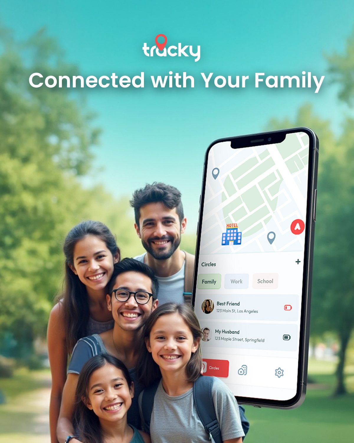
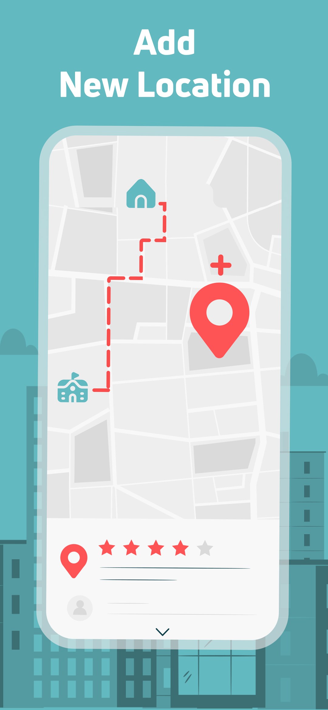
The map is the home screen. Family members show up as personalised avatars rather than generic pins, and circles group contacts by context — Family, Work, School. The invitation flow was rewritten four times to strip out friction and permission anxiety.

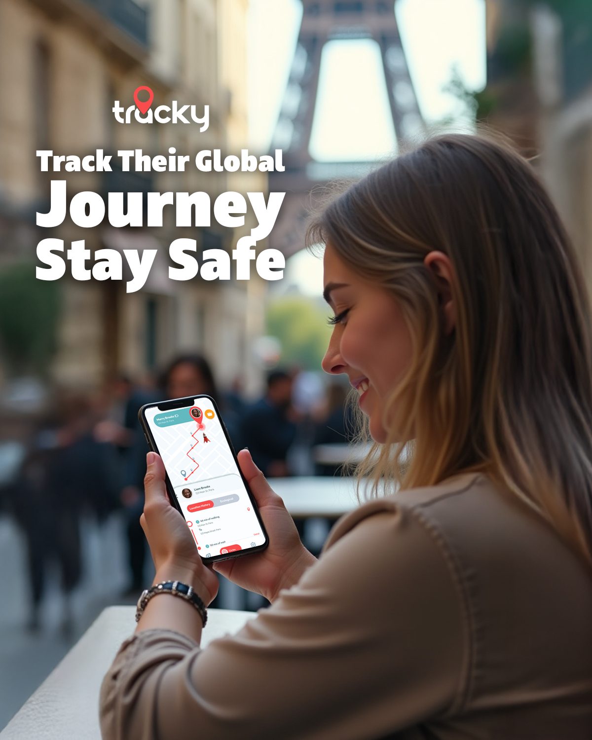
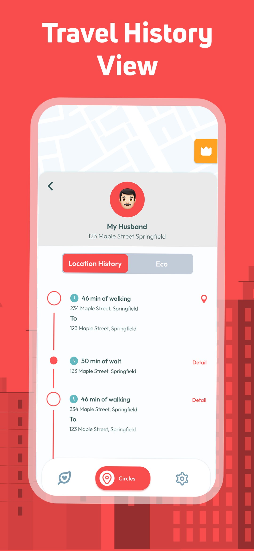
Raw GPS coordinates are useless to a parent at 6pm. The timeline turns them into a readable narrative — walking segments, stops and transit routes separated by colour and ordered by time, so the day can be understood in one scroll instead of decoded.

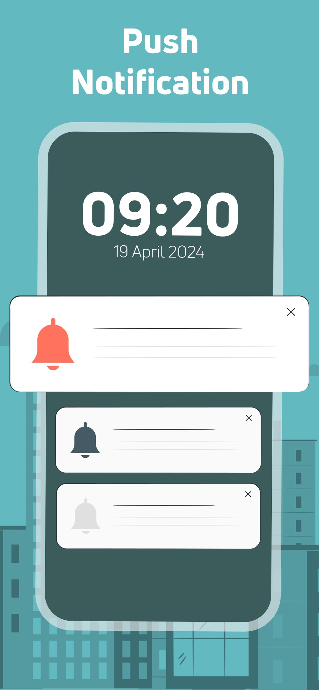
Safe zones are drawn directly on the map — no radius fields, no address forms. Alerts run on a tiered hierarchy so only genuinely critical events push through, which is what keeps users from switching notifications off entirely and losing the product's whole value.

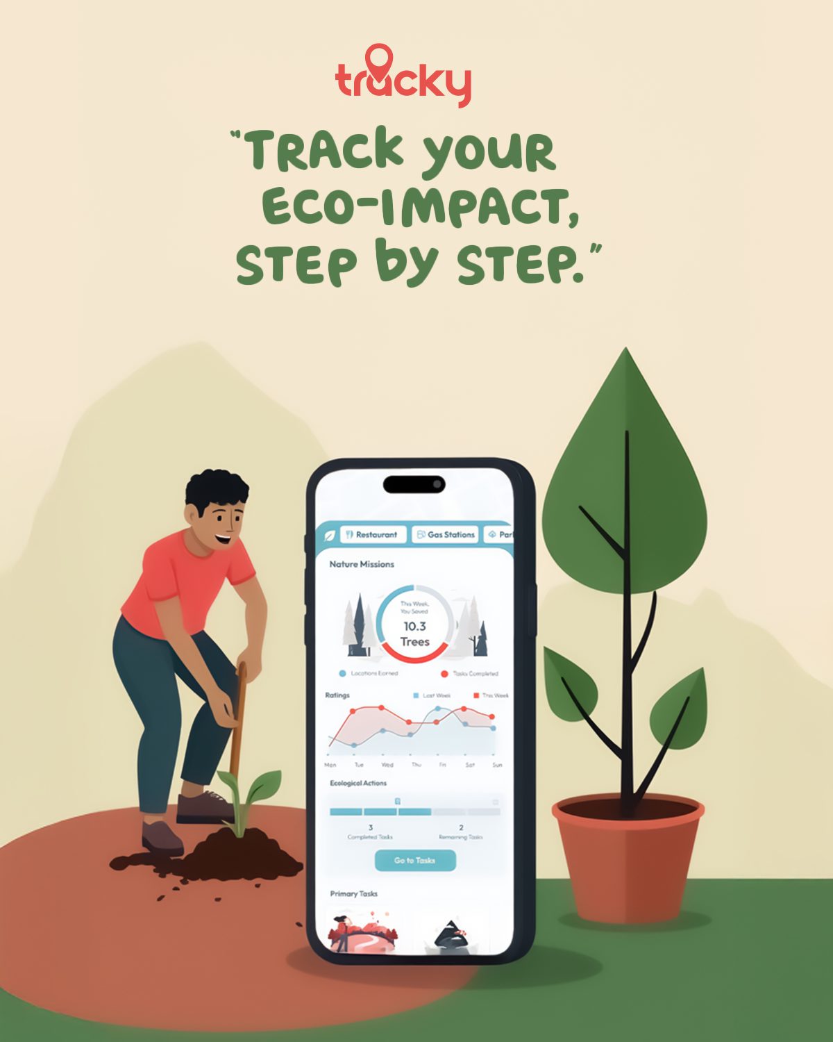
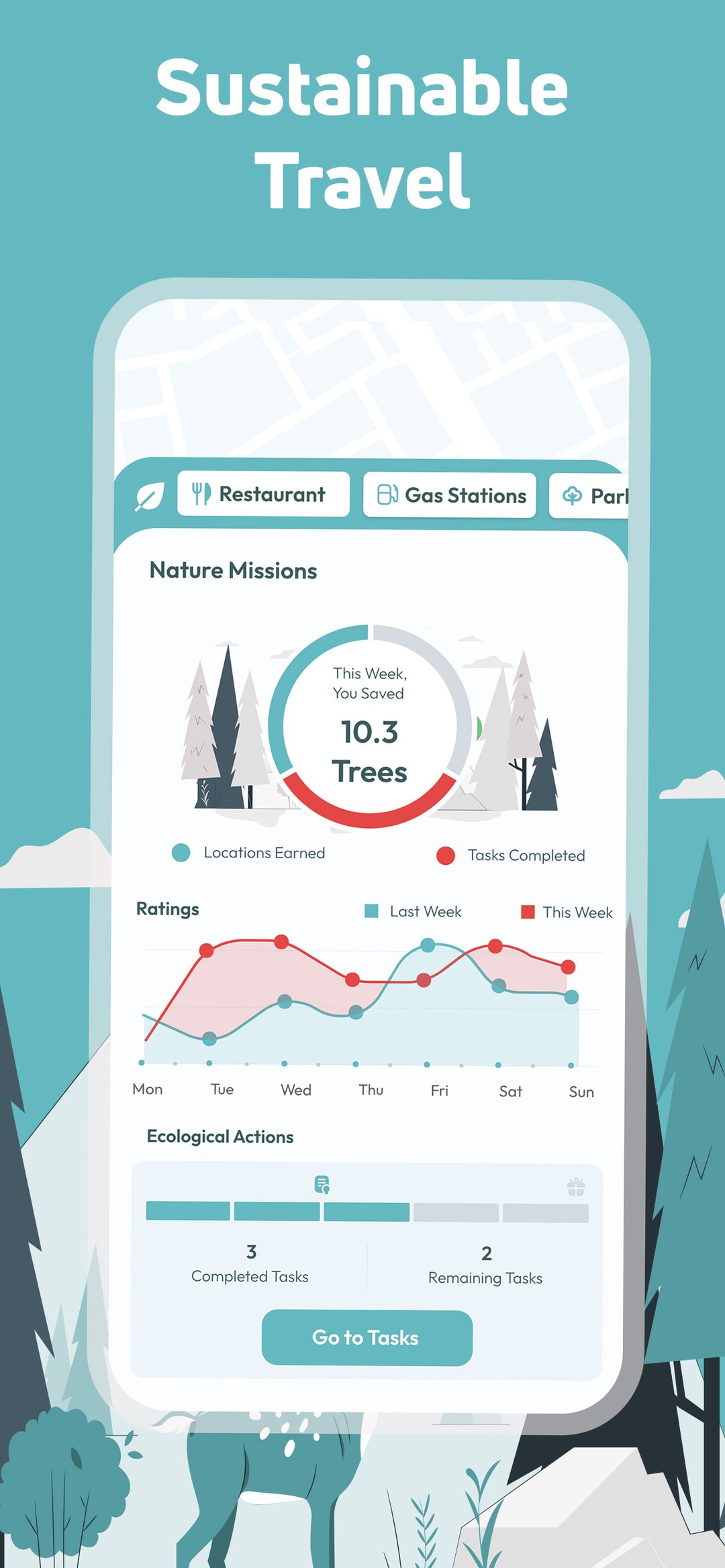
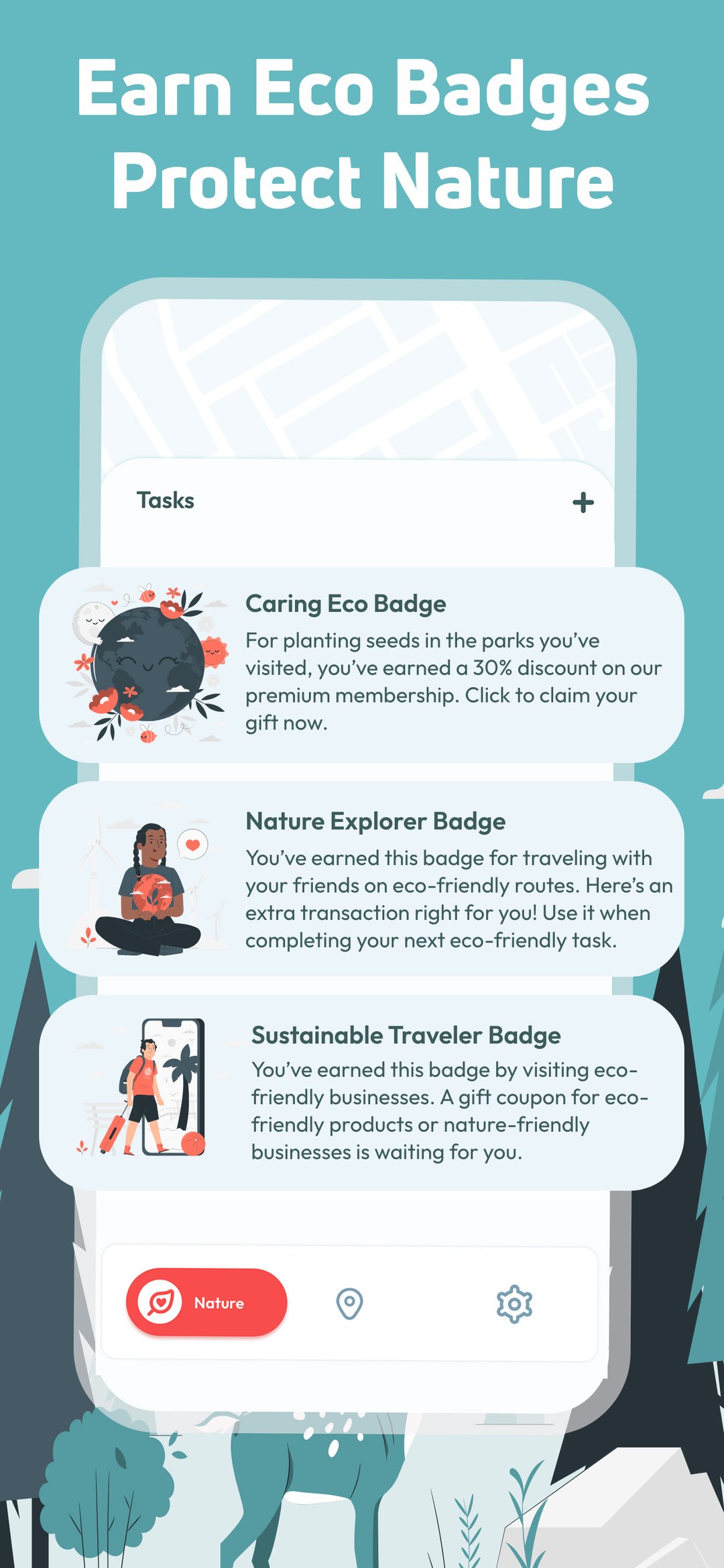
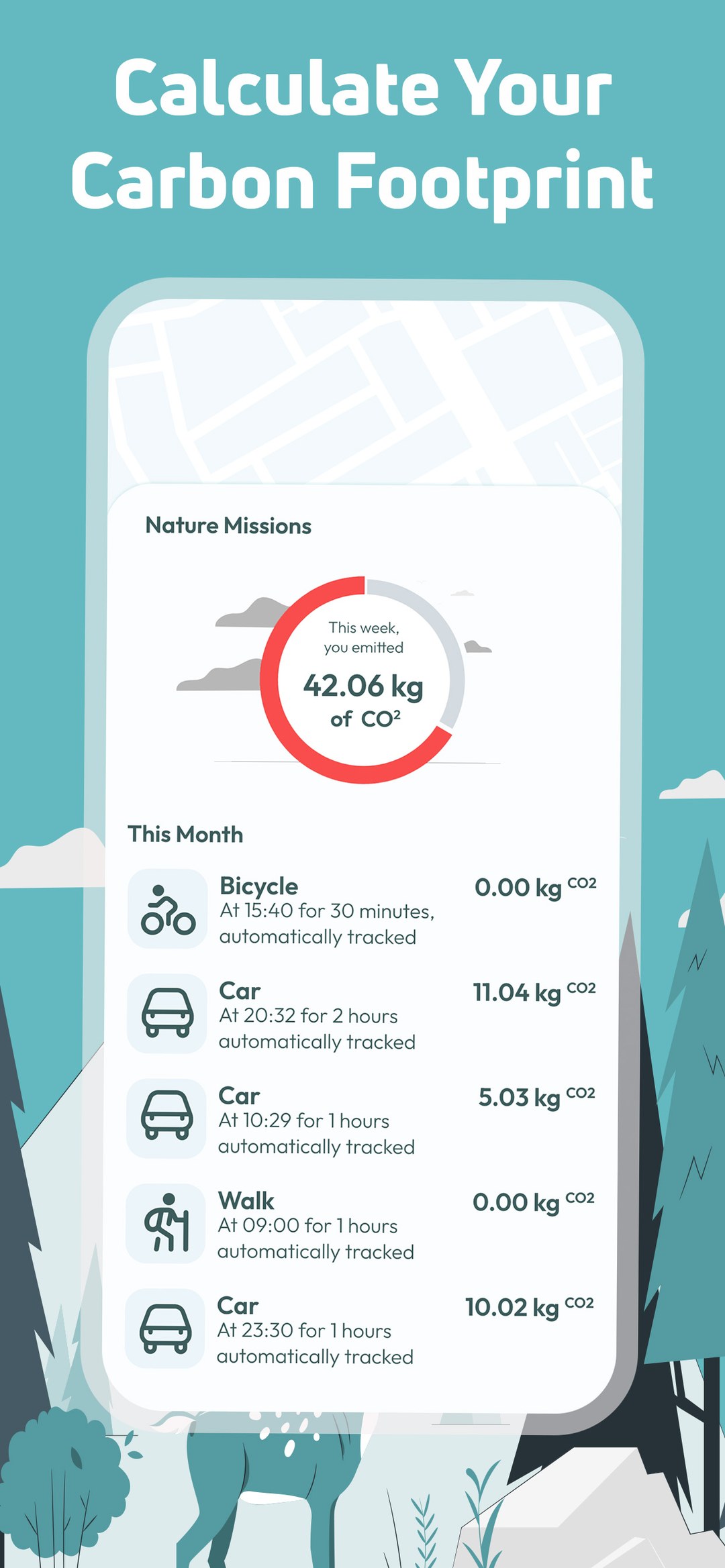
A gamification layer that rewards walking, public transport and time in green spaces with badges. The Nature Missions dashboard reports weekly impact — trees preserved, missions completed — which quietly turns a tracking app into something the family does together rather than something done to one member of it.

One warm accent doing all the signalling, on a neutral base that lets a map breathe.
Coral is reserved for one job only: something needs your attention. Green appears exclusively in the sustainability layer, so its meaning stays intact.
A geometric sans across the whole product — high x-height for map labels at small sizes, wide numerals for timestamps and distance.
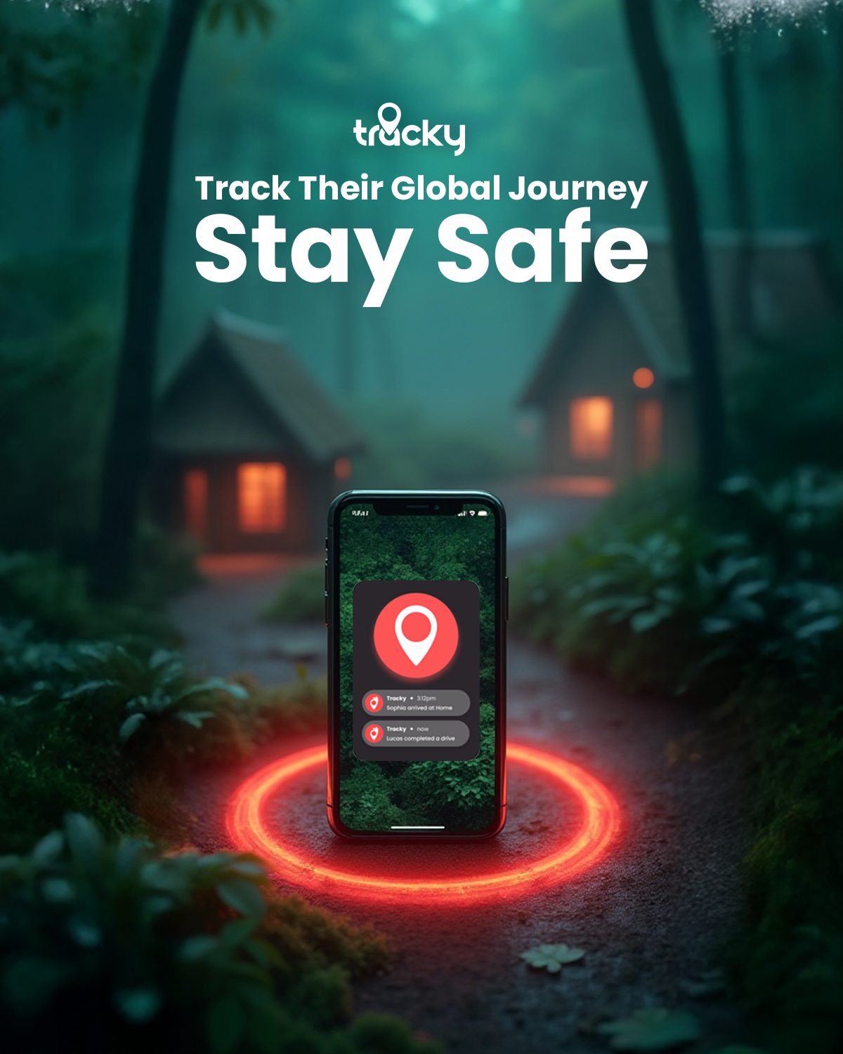
Location tracking is sold on an uncomfortable emotion. Lean too hard on fear and the ad reads as surveillance — the app gets reported and the brand becomes something you hide. Go too soft and nothing stops the scroll. Every ad had to hold that line: enough tension to earn two seconds, never enough to make the viewer feel accused.
A moment of doubt, a hard cut to the real interface, then release. The opening line is written as the viewer's own thought rather than a claim the brand makes about them — in a category one step away from feeling like surveillance, that is the difference between an ad that gets saved and one that gets reported.
Every app moment in the ads is genuine screen recording of the interface I designed. A rendered mockup reads as a promise; a real interface reads as proof — and the cut from a human face to the product is the exact frame where the viewer decides whether to believe the claim.
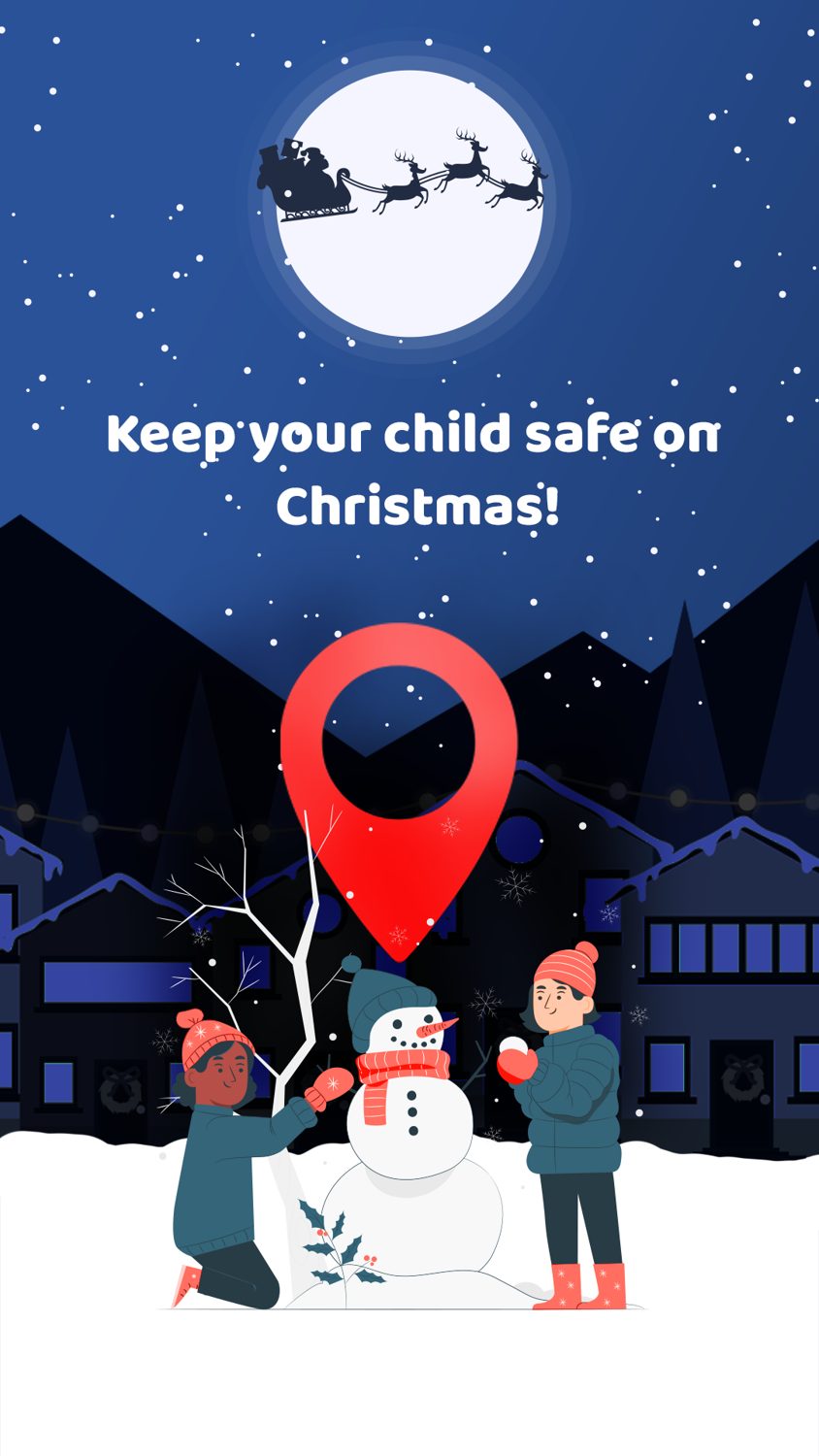
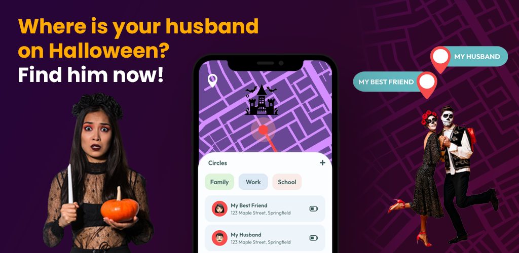
Halloween and Christmas sets reuse the proven structure and swap only context and palette. The campaign feels new during high-intent shopping periods without spending the testing budget again on something that already works — a seasonal burst ships in days rather than weeks.
The App Store screenshots carry the same pin, palette and sentence structure as the videos. A user arriving from an ad should recognise the page instantly — any visual gap between ad and store page is a place where the install is lost, so both were designed as one continuous piece.
Every static in the acquisition funnel — feed banners, store screenshots and feature graphics — written, art-directed and produced in one hand.
⤢
⤢
⤢
⤢
⤢Halloween, Christmas and New Year bursts built on the evergreen skeleton — same beats, new context and palette.
⤢
⤢
⤢
At this scale, millions of downloads translate into dozens of edge cases every day — wrong permissions, battery constraints, privacy objections, platform inconsistencies. Working directly off support data changed how I iterate: every recurring ticket pattern became a design opportunity.
Store creative is product design. In a trust-sensitive category the ad is part of the product's safety story, not a layer on top of it — the ads that looked most like ads were exactly the ones that made the app feel invasive.
Every screenshot below is a shipped asset — designed as the final frame of the acquisition funnel.
⤢
⤢
⤢
⤢
⤢
⤢
⤢
⤢Every interface, icon and store screen was designed by hand in Figma, Adobe XD, After Effects and Illustrator — no UI kits, no templates. Generative tools were used in ad production, always under my own art direction and never as the author of the design.